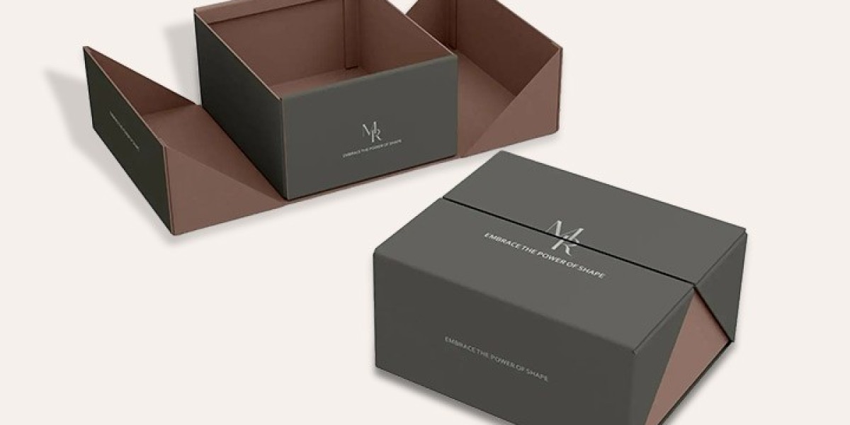

Luxury Packaging on a Budget: Where Structure and Simplicity Meet
Shoulder Rigid Boxes give you a layered, high end opening experience because the lid rests on a raised step built into the base. Pair that structure with a restrained one ink design and you get a premium result without the cost of heavy printing. Here is how the two ideas work together and when they make sense.
Start With the Shape: What a Shoulder Box Really Is
A shoulder box, often called a neck box, has two parts. The base has a narrower upper section, the "shoulder," that rises above the main body. The lid slips down over that section and rests on the shoulder, leaving a thin, deliberate gap between the lid and the base.
That gap is the signature. It makes the box look tailored, a bit like a well cut jacket. When a customer lifts the lid, the air inside creates a soft resistance, which feels slow and intentional. It is a small detail, but small details are exactly what people remember about packaging.
Why the Raised Step Matters for Protection
The shoulder is not only decorative. It acts as a guide that keeps the lid aligned and stops it from shifting during handling. It also lets you add a tray, a ribbon pull or a foam insert underneath without crowding the opening. For fragile items such as candles, glass bottles or electronics, that extra internal structure is useful.
The Case for Printing Less
Many brands assume that a premium box needs full coverage artwork, multiple foils and layered textures. In practice, restraint often reads as more expensive. A deep navy, a warm cream or a matte black surface with a single logo can look more confident than a busy design.
Single Color Rigid Boxes use one ink or one wrapping paper shade for the whole design, which cuts setup work, reduces the chance of color mismatches and shortens production. The savings can then go toward better board thickness, a nicer paper texture or a finish such as embossing, where the box earns its premium feel through touch rather than print.
Where One Color Works Best
One color suits brands with a clear, minimal identity. Skincare, fine jewelry, candles, stationery and boutique tech accessories all tend to look good in a single shade. It also helps when you order several sizes, because every box in the range matches without extra color proofing.
Design Choices That Make a Simple Box Feel Rich
When you limit the palette, the other decisions carry more weight. These are the ones worth spending time on:
- Paper texture: Linen, felt and soft touch papers add depth that flat color cannot.
- Logo treatment: A small foil or blind emboss on the lid draws the eye without needing extra ink.
- Interior color: A contrasting inside, such as blush against charcoal, turns the opening into a quiet surprise.
- Insert design: A snug, custom cut insert makes the product look intentionally presented.
Think of it like cooking with few ingredients. Every one has to be good.
Does Packaging Really Influence Buying?
It does, and the evidence is fairly consistent. An Ipsos study commissioned by the Paper and Packaging Board found that 72 percent of American consumers say package design influences their purchase decisions. That is a strong reason to treat the box as part of the product rather than a wrapper.
For smaller brands, this is encouraging. You do not need a huge print budget to make a strong impression. A well proportioned structure and a disciplined color choice can do much of the work.
Planning Your Order Without Surprises
Before you commit, walk through a short checklist:
- Measure your product with its protective inserts, not the bare item.
- Decide how much negative space you want around it inside the box.
- Request a plain white sample first to check proportions and the lid fit.
- Ask for a printed or wrapped sample once the color and finish are chosen.
Shoulder Rigid Boxes need accurate tolerances, because the lid must slide down smoothly without being loose. That is why a physical sample is worth the wait. A box that looks perfect in a render can still feel stiff or wobbly in the hand.
Lead time and minimum quantities vary by supplier, so confirm both early. If you are launching a new product, a smaller first run lets you test the packaging with real customers before scaling up.
Frequently Asked Questions
Are shoulder boxes more expensive than standard lid and base boxes?
They can cost slightly more because the neck section adds material and requires tighter construction. However, choosing a single ink or single paper color can offset that difference, so the total often lands close to a more heavily printed standard box.
Can a one color design still look branded?
Yes. Texture, embossing, foil stamping and a clear logo placement all create identity. Many luxury brands use one dominant color so the packaging becomes instantly recognizable.
How do I choose the right lid gap?
The gap is set by the box maker based on board thickness and size. If you have a preference, ask for a sample with a tighter or looser fit and compare how each one feels when opened.
Final Thoughts
Good packaging does not have to be loud. A thoughtful structure, a confident color and a couple of well chosen finishes can make a modest product feel considered and valuable. Shoulder Rigid Boxes bring the architecture, one color brings the discipline, and together they offer a practical route to a premium unboxing. Order a sample, test it with your product, and let the details guide the final decision.